Introduction
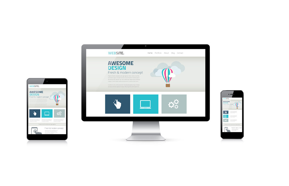
Responsive design is now become the basic need for every website. Everyone is aware of it, whether you are a website owner or a designer. So for the designer, it is an important thing to craft the design with proper media queries. However, there are many pre built CSS frameworks available today. Bootstrap is one of the industry leading CSS framework. But today, I am going to talk about custom media queries and it’s possibilities with mobile first design approach.
As a coder, you probably don’t want to repeat yourself while coding. So DRY approach is better where we can use SASS and SCSS with automated compilation using Node.js. I will talk about it in other post someday. Let’s see the basics of mobile first design approach.
The Approach
We can approach any design with either desktop first or mobile first method. But both have pros and cons. As per the code below, we have a basic HTML structure without any CSS for layout structure.
<!-- HTML Start -->
<div class="example-div">
    <header>
        <h3>I am a heading</h3>
    </header>
    <div class="content-wrap">
        <section>
            All body content goes here.
        </section>
        <aside>
            All sidebar widgets goes here.
        </aside>
    </div>
    <footer>
        Footer items goes here.
    </footer>
</div>
<!-- HTML End -->
/* CSS Goes Here */
.example-div {
font-family: Roboto, sans-serif;
border: 1px solid #dddddd;
padding: 30px;
margin-bottom: 30px;
}
.example-div header{
background-color: #f8f9fa;
padding: 30px;
}
.example-div section{
background-color: #dddddd;
padding: 30px;
}
.example-div aside{
background-color: skyblue;
padding: 30px;
}
.example-div footer{
background-color: #444444;
color: #ffffff;
padding: 30px;
}The above code will render like this –
I am a heading
Now, if you notice, I haven’t done any CSS for either desktop screens or mobile screens. But certainly the layout fits great in all mobile views. In fact in all screen sizes it fits. Though the design for larger screen sizes are too basic. At this point, we can do two things.
- Ignore the mobile views first and start designing the desktop views and then set media queries for mobiles. Which I will call desktop first approach.
- Appreciate what we have first as it seems OK for mobile views and start designing the larger screens with media queries.
Both approach will certainly reach the end goal but the first approach will be more time consuming and less manageable. The second approach which I will show now, is more flexible, less time consuming, less complex and highly manageable.
Media Queries for Desktops
Adding the CSS code below will set the desktop views more properly as we did it with media query –
@media (min-width: 768px){
    .example-div .content-wrap{
        display: flex;
    }
    .example-div .content-wrap section{
        width: 70%;
    }
    .example-div .content-wrap aside{
        width: 30%;
    }
}
The above code will render the HTML code like below. It is now set from 768px and up. Likewise we can set different screens with min-width setting inside another media query. Like this – @media (min-width: 992px){ /* css here */ }
I am a heading
If you are following along, you can see that we have written a fairly less amount of code than approaching it as desktop view first. Because if we write CSS for larger screen first, we have to use max-width property in media query like this @media (max-width: 767px){ /* css here */ }. Also we might have to set it for individual elements. That is something difficult to manage.
Conclusion
Bottomline is it’s up to you how you plan your design. At the same time, it is also important to plan your HTML structure properly. A well planned HTML structure can save lots of time for CSS coding. However, I just tried to explore the basics of two different design approaches with simplest possible HTML structure. Complex HTML can demand both CSS approaches together.
Let me know what you think about this in comments.